Data is a powerful tool for making claims about the world. STS 101 examines the social forces that impact the availability, structure, and governance of data, as well as the forms of ethics, activism, and advocacy that emerge around data. STS 101 provides students with skills in ethical data analysis and interpretation. By learning core techniques of data science, students also learn to think critically about what a data set represents and how it functions in different contexts.
The course explores the cultural and political histories of a number of civic datasets – covering topics such as eviction, pollution, crime, education, and civic infrastructure. The course integrates critical reflection with critical data practice, encouraging students to see data ethics as something they can and should consider everyday rather than something they only do in a compliance capacity before data analysis or in an auditing capacity after data analysis.[1] In STS 101, students clean, analyze, map, and visualize data in ways that show why attention to data politics and ethics matter. How do we do this? Here are just a few examples:
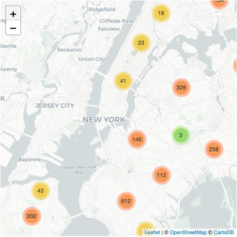
Mapping the Biases in 311 Data
How do certain communities become both under- and over-represented in data, and what consequences does this pose to critical decision-making?
Increasingly, cities are relying on data about the number of calls received to 311 – a city’s non-emergency help line – to determine how to prioritize issues such as noise control, the maintenance of potholes, and homelessness. Yet, as a crowd-sourced dataset, 311 data only represents where people are calling about these issues, not the extent of the issues themselves. In this unit, we map the neighborhoods in which calls to 311 in various cities tend to be concentrated, and compare this to the socio-demographics of the communities represented. We discuss how 311 data, at different times, can under-represent the needs of communities that do not know that it exists, that do not trust government officials to address local problems, or that face infrastructural barriers to reporting. We also discuss how it can be (and has been) weaponized against particular communities when anonymous reporters repeatedly call to complain about certain businesses or individuals in order to raise their profile in the data. In the process, we reflect on how data can marginalize the needs of certain communities, and also how it can become a tool of discrimination.
Plotting the Politics of Definitions in Data about Pollution
How do the vested interests and influence of various stakeholders shape data semantics and categories – determining “what counts” in data?
What we know about toxic emissions in the United States is in part mediated by what toxic emissions industrial facilities are required to report. For decades environmental activists have pushed for more robust reporting of toxic emissions, while lobbyists from industry have pushed to reduce the burden of industrial reporting. The political battles are reflected in the data we currently have about pollution in the US. In this unit, we plot data about toxic emissions in the US over the course of two decades, while simultaneously examining changes in US policy regarding what forms of pollution facilities are required to report. We discuss how politics play a role in setting the standards, definitions, and categories into which data get reported, and in the process shape what we come to know about environmental problems facing the US.
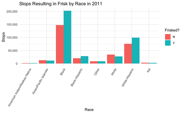
Visualizing Institutional Incentives to “Juke the Stats”
How do institutional incentives shape data reporting? How can communities reclaim biased data to advance critical claims?
Since the 1990s, in a number of US cities, statistical analysis has been a key strategy in policing – determining where officers will be deployed and when. Further, data has become a tool for accountability in policing with a reduction in crime counts serving as a primary indicator of effectiveness and officers getting rewarded and penalized based on metrics. In some major cities, including NYC, this “numbers game” institutionally-incentivized officers to over-police certain communities and inflate or deflate crime counts. In this unit, we examine NYC data reporting every stop, question, and frisk incident in NYC – data compiled by the officers that performed the stop. First, we discuss the potential flaws in the data, and how those flaws emerge from particular institutional data cultures. With the same data, we then reproduce some of the calculations and visualizations that the New York Civil Liberties Union presented in the Supreme Court case that ultimately determined that stop, question, and frisk was being carried out unconstitutionally in NYC. In the process, we talk about how communities can reclaim even biased data in critical ways.
Throughout the course, students engage with reading in critical data studies, journal on issues related to data ethics that they see out in the world, and practice critical reflection as they produce their own data calculations and plots. For the final, students complete a writing assignment that encourages them to think through how data analysis techniques can be used to support diverse, and sometimes conflicting claims. Students select a dataset and are tasked with producing a series of calculations and visualizations that support a claim that they believe to be true. They are then tasked with playing “devil’s advocate,” showcasing how an opponent could refute the claim with the same data by cherry-picking certain variables, aggregating the data to a scale that hides certain issues, or producing misleading plots. Referencing topics discussed throughout the course, they reflect on why such representations of the data are disingenuous. The assignment foregrounds the ways that data can be configured in deceptive ways, and helps students better anticipate and call out unethical data practices.